Thursday, April 17, 2014

Index Value Plot

http://waterwatch.usgs.gov/index.php?id=real&sid=w__plot&r=nc

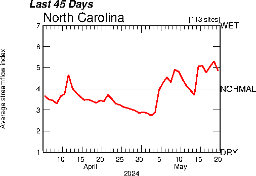
An index value plot is similar to a line plot but instead of absolute values, data is plotted as an index as the name suggests. In this map, we can see the average stream flow in North Carolina over a period of 45 days on a wet/dry scale with 1 being the driest and 7 being the wettest.

Population Profile

http://www.japanfocus.org/-Glenda_S_-Roberts/3450

Population profiles show numbers of people in a population as a function of their age. The population profiles above show the number of people in millions in each age group of five year increments. By comparing these three population profiles we can see that the distribution of ages will shift from a high population of younger people in 1950 to a slightly more even distribution in 2050.

Correlation Matrix

http://www.medscape.com/viewarticle/571448

A correlation matrix is an easy way to display the correlation value, r, between all variables in a set of data. This correlation matrix shows the correlations of different cognitive abilities in adults with HIV.

Similarity Matrix

http://www.biomedcentral.com/1471-2164/8/353/figure/F5?highres=y

A similarity matrix is used to express a variables similarity to another. In this matrix, different gene expressions are compared to each other. The darkest red symbolize the strongest similarity while the white represents no similarity. Everything in between is graded on a monochromatic scale.

Stem and Leaf Plot

http://hci.stanford.edu/jheer/files/zoo/

Stem and Leaf plots are a method of displaying numerical data where the stem column on the left represents the first digit and the leaf rows on the right represent the next digit associated with the stem. This type of plot, like the histogram, makes the distribution of numbers more clear and makes it easier to recognize the frequency and mode.

Box Plot

http://www.itl.nist.gov/div898/handbook/eda/gif/boxplot0.gif

Box plots graphically display data by their quartiles. The lowest data point being the minimum and the highest being the maximum, the box then shows the spread between the first and third quartile and the line in the middle is the median. In this graph, four box plots and displayed on the same graph so that the four machines could be compared against each other.

Histogram

http://www.statcan.gc.ca/edu/power-pouvoir/ch9/histo/5214822-eng.htm

Histograms are used to display the distribution of continuous data such as height, weight, salary, etc. If the data were categorical the bars would be separated but since the values are continuous, the bars are together. each bar represents the frequency at which the phenomena occurs in each range along the x axis.