http://waterwatch.usgs.gov/index.php?id=real&sid=w__plot&r=nc
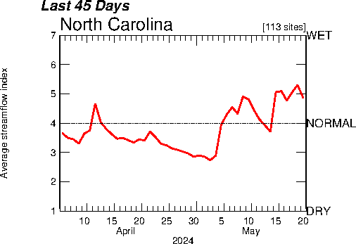
An index value plot is similar to a line plot but instead of absolute values, data is plotted as an index as the name suggests. In this map, we can see the average stream flow in North Carolina over a period of 45 days on a wet/dry scale with 1 being the driest and 7 being the wettest.
Thursday, April 17, 2014
Population Profile
http://www.japanfocus.org/-Glenda_S_-Roberts/3450
Population profiles show numbers of people in a population as a function of their age. The population profiles above show the number of people in millions in each age group of five year increments. By comparing these three population profiles we can see that the distribution of ages will shift from a high population of younger people in 1950 to a slightly more even distribution in 2050.
Correlation Matrix
http://www.medscape.com/viewarticle/571448
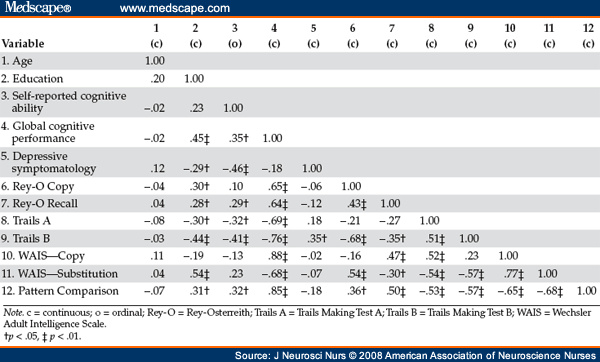
A correlation matrix is an easy way to display the correlation value, r, between all variables in a set of data. This correlation matrix shows the correlations of different cognitive abilities in adults with HIV.
Similarity Matrix
http://www.biomedcentral.com/1471-2164/8/353/figure/F5?highres=y
A similarity matrix is used to express a variables similarity to another. In this matrix, different gene expressions are compared to each other. The darkest red symbolize the strongest similarity while the white represents no similarity. Everything in between is graded on a monochromatic scale.
Stem and Leaf Plot
http://hci.stanford.edu/jheer/files/zoo/
Stem and Leaf plots are a method of displaying numerical data where the stem column on the left represents the first digit and the leaf rows on the right represent the next digit associated with the stem. This type of plot, like the histogram, makes the distribution of numbers more clear and makes it easier to recognize the frequency and mode.
Box Plot
http://www.itl.nist.gov/div898/handbook/eda/gif/boxplot0.gif
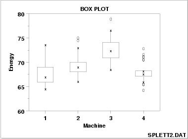
Box plots graphically display data by their quartiles. The lowest data point being the minimum and the highest being the maximum, the box then shows the spread between the first and third quartile and the line in the middle is the median. In this graph, four box plots and displayed on the same graph so that the four machines could be compared against each other.
Histogram
http://www.statcan.gc.ca/edu/power-pouvoir/ch9/histo/5214822-eng.htm
Histograms are used to display the distribution of continuous data such as height, weight, salary, etc. If the data were categorical the bars would be separated but since the values are continuous, the bars are together. each bar represents the frequency at which the phenomena occurs in each range along the x axis.
Star Plot
http://www.nehu.ac.in/iqac/quality_radars.html
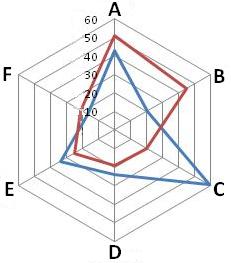
Star plots, more commonly known as radar charts, are for plotting multivariable data. Each variable is represented by an equal spoke (A-F) and the data points are plotted along each spoke. The data points are then connected to gauge the overall magnitude of the data. This technique is commonly applied to quality assessment so one could improve something with multiple standards.
Triangular Plot
http://geology.about.com/od/sediment_soil/ss/Soil-Classification-Diagram.htm
Triangular plots also known as ternary plots are used to plot three variables against each other that sum to a constant. It is commonly used in the physical sciences to show three different parts of a whole such as above. This triangle was presented to me in my physical geography class displaying the different percent concentrations of clay, sand, and silt that make up different loams.
Windrose
http://www.erh.noaa.gov/bgm/aviation/windroses/windrose.shtml
A windrose plot is used by meteorologists to diagram wind frequency and strength from various directions in a given area. This windrose is for Binghampton, NY. The colors represent varying levels of wind speed. These diagrams are commonly used at airports for their usefulness in demonstrating average wind patterns.
Climograph
http://www.colorado.edu/geography/extra/geogweb/bouldercreek-2/preview/page2.html
A climograph is a combination of multiple graph types to convey change of climate factors over time. In this particular graph, both line and bar graphs are used to show the change in monthly average precipitation and temperature in Boulder, Colorado over the course of a year.
Scatter Plot
http://www.gardenersown.co.uk/education/lectures/r/graphs2.htm
Scatter plots are used to graph data obtained from an experimenter to show the correlation between independent and dependent variables. The independent variable is the variable that the experimenter controls, in this case it is speed, and the dependent variable is the data collected at each speed tested. After it is plotted, we can either see a positive correlation, shown above, a negative correlation or no correlation. It is important to remember however that correlation does not prove causation.
Accumulative Line Graph
http://www.unc.edu/~nielsen/special/s2/s2.htm
An accumulative line graph otherwise known as a Lorenz Curve is used to show the distribution of wealth. The perfectly diagonal line represents perfect equality of wealth. The curved line beneath it represents the inequality of wealth distribution by graphing what percentage of the population posses what percentage of the nation's total wealth.
Bilateral Graph
http://www.medscape.org/viewarticle/576121_2
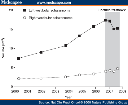
Bilateral graphs compare two different but related sets of data on the same graph. They can be displayed as many different types of graphs including but not limited to line graphs and bar graphs. The bilateral line graph shown above compares the volume of right and left vestibular schwannoma tumors before and during treatment.
Nominal Area Choropleth Map
http://www.censusscope.org/us/map_common_race.html
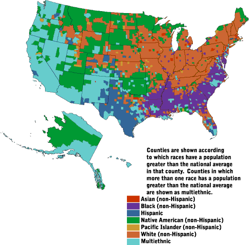
This choropleth map is considered to be nominal area because the information on the map is non numerical. Instead the data is categorical, showing which demographic population is greater than the national average in each county of the United States.
Wednesday, April 16, 2014
Unstandardized Choropleth Maps
http://www.geogonline.org.uk/as_g2_popdensitymaps.htm
Unstandardized choropleth maps present enumerated data in the raw form rather than averaging it or gaining a percentage or ratio. This maps displays the population density across the world in the number of persons per square kilometer.
Standardized Choropleth
Standardized choropleth maps are thematic maps that present analyzed data as ratios or percentages if you look at the keys in the bottom left corners of the images above. These maps present the percent of population change from 1960 to 1970 by county.
Univariate Choropleth maps
http://eps.mq.edu.au/courses/GEOS219/choropleth.htm
Univariate choropleth maps are generic thematic maps that only display one statistical variable using chromatic shading of distinctly bordered areas. In this map, fertility rates are represented with higher rates being a darker shade on the grayscale. We can see geographic patterns very easily this way.
Bivariate Choropleth Maps
http://www.geo.unizh.ch/~annal/Choropleth%20maps.html
Bivariate choropleth maps combine two different variables on the same map by plotting the data on a two color plot, one color scale for each variable. While this type of map is good for synthesizing related variables to look for geographic patterns, sometimes the readability of the maps are ineffective.
Tuesday, April 15, 2014
Unclassed Choropleth Map
http://indiemapper.com/app/learnmore.php?l=choropleth
Unclassed choropleth maps the data is plotted along a monochromatic color scale and each data point is assigned a different color as opposed to grouped intervals. Unclassed choropleth maps are better for ranking larger data sets so that overall patterns can be seen.
Subscribe to:
Posts (Atom)